File:Adj poss.png
Jump to navigation
Jump to search
No higher resolution available.
Adj_poss.png (236 × 219 pixels, file size: 25 KB, MIME type: image/png)
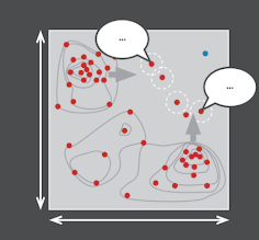
Figure 1. The graph represents the quantitative results of a research project. The red dots represent the quantitative data from each respondent. The blue dot represents the ideal location for data points on the graph. There are two clusters; one in the top left and one in the bottom right of the graph. The grey arrows represent the direction in which these respondents should ‘shift’ to get closer to the ideal.
File history
Click on a date/time to view the file as it appeared at that time.
| Date/Time | Thumbnail | Dimensions | User | Comment | |
|---|---|---|---|---|---|
| current | 09:41, 20 August 2021 | | 236 × 219 (25 KB) | L.Doyle (talk | contribs) |
You cannot overwrite this file.
File usage
The following page links to this file: