Dyad x,y plot interpretation
This section gives a mechanical and some technical details to the interpretation of the Dyad x,y plots.
It is hoped that some users from the SenseMaker® practitioners community will create content to walk through practical examples and analyst mindset when using the xy plots.
Smoothing Curves
The workbench provides for linear and non-linear smoothing curves. These give you an overview of the correlation between the x and y axis placements. A quick helicopter view of the shape of the data. This can be particularly useful with very large datasets.
The linear curve does a linear approximation to the correlation of the data, whereas the non-linear curve attempts a closer fit to the actual shape of the plotted data.
Example 1
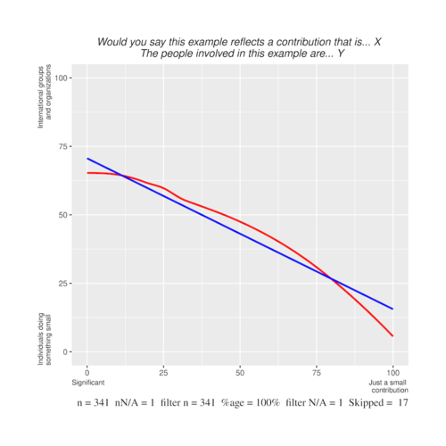
A negative correlation where the linear and non-linear are close, indicating an even spread of the data along the correlation line.
In this case it is showing that significant contributions are contributed by international groups and organisations and as one moves to small contributions, these are progressively contributed by individuals doing something small.
You can see, because on the left side of the graph the line does not go to the top, that the significant examples are not all international groups and organisations. Some examples are from individuals. But as the line on the right hand side drops to the bottom, there is little small contributions from international groups and organisations. In fact, a proportion of just over 1/4 of significant examples are from individuals.
The interpretation is confirmed by a display of the contours and/or dots. This is explained below.
Example 2=
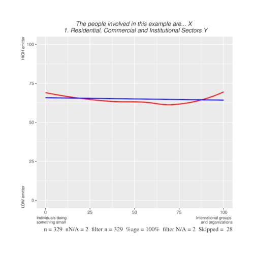
No correlation - thus flat smooth curve (indicating no correlation) where the linear and non-linear are close, indicating an even spread of the data along the correlation line.
In this case, it is showing that there are no specific correlation between individuals doing something small and international groups and organisations to the emission levels. But the line being just under the 75% indicates that both for individuals and organisations, the level of emissions is quite high.
Again, the interpretation is confirmed by a display of the contours and/or dots. This is explained below.
Example 3
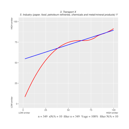
This is an x,y plot between Transport and Industry as low and high emitters. The correlation is very positive between Transport and Industry - that is when transport is low, industry is low, when transport is high, industry is high.
However, the core feature of this graph is that the non-linear curve is very different at the left side of the graph to the linear curve. The linear curve indicates that while the correlation is positive, in fact a very low transport, while indicating low for industry is still over 50% for industry, thus still quite high in comparison to transport. However, the non-linear curve indicates that at the left there are outliers to the bottom for industry - that is there are cases here where genuine low transport correlates to genuinely low industry.
Again, the interpretation is confirmed by a display of the contours and/or dots. This is explained below.


