Quick ux and ui update list
Jump to navigation
Jump to search
This page contains all that is suggested for some early simple updates initially undertaken by our Intern Andrea working from Singapore.
Last Ideas Before Phase One Complete
These are the points remaining after the current deployment work
- Right menu independently scroll.
- Logos as per Platform; the bottom CognitiveEdge one and SenseMaker one on the top left.
- Copyright to be added.
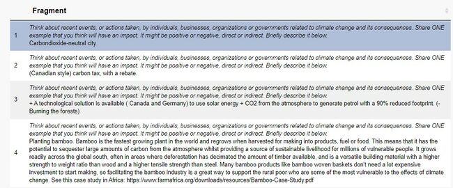
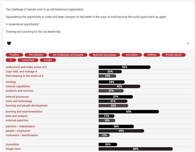
- Each fragment/story (Fig 1.) can have a dropdown to show signification, similar to those on the Platform (Fig 2.)
NOTE: We can deal with this by also having an iframe link to the Platform Explorer - Option to choose the number of panels across the screen in horizontal layout
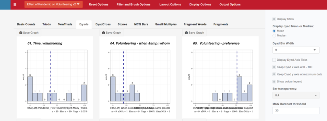
As shown in Fig 3, a smaller screen squeezes the horizontal layout for dyads (and presumably for other signifier types). While we can move to a vertical layout, it is often helpful to see two images alongside each other. Rather than changing the default number across the screen, perhaps the layout options could allow specification of how many to put across the visible screen (or allow the screen to scroll??) - Add "No data" option to Show Counts or Percentages under Display Options
The numbers on the bar charts shown in Fig 3 are sometimes not needed (particularly the zero's). It would be helpful to have an option for "no data" under the options for Numbers and Percentages. - Filter funnel on right-hand side disappears when left-hand menu is hidden
The filter funnel should remain in sight at all times and particularly when the right-hand filter panel is open. If the funnel is hidden when the filter panel is open, there is no obvious way to close it.


